Open and Accurate Air Quality Monitors
We design professional, accurate and long-lasting air quality monitors that are open-source and open-hardware so that you have full control on how you want to use the monitor.
Learn MoreWhen people talk about air quality data, the conversation can often feel overwhelming. These discussions are often packed with numbers, maps, and research that might be difficult to interpret and keep up with — especially if you don’t have a technical or scientific background. But what happens when someone decides to make that knowledge easier to understand, one topic at a time?
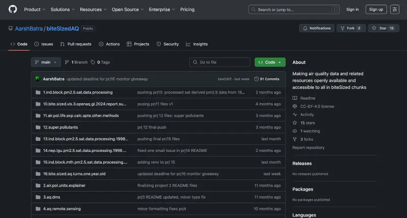
That’s the intention behind biteSizedAQ, a public GitHub repository created by data scientist Aarsh Batra. Since launching biteSizedAQ, Aarsh has written blog posts, released datasets, and designed clean visual explainers — all openly available, and all built to help others learn from the ground up. There’s no team behind it. Just curiosity, dedication, and the belief that good information should be shared.
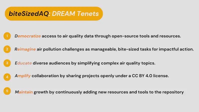
Here is how Aarsh summarizes biteSizedAQ’s DREAM tenets, which at every moment guides the project:
Curious to learn more about the story behind the project, I had the chance to speak with Aarsh about how it all began, what drives his work, and where he hopes to take biteSizedAQ next.
Aarsh’s entry into the world of air quality began in 2021, when he joined the Energy Policy Institute at the University of Chicago’s India office, in New Delhi. One of his first projects involved working with vehicle pollution check certificate data, where he first encountered the challenges of accessing and cleaning large and messy pollution datasets. It was during this time that he started thinking more deeply about the value of public access to fully open data in a maximally useful and analysis ready format.
He later started working on the Air Quality Life Index project, where he was introduced to satellite-derived PM2.5 data and given the opportunity to make the project’s various resources and data pipelines Open Source and available via GitHub. As a result of making this transition, Aarsh gained valuable insights about the Open Source Ecosystem. The AQLI pipeline produces estimates for the average life years lost as a result of breathing polluted air at a very granular level (e.g. district level) for the entire world. It was there that he encountered a different, more tangible approach to communicating air pollution information, that goes beyond simple AQI numbers.
“[AQLI] tells you at a very granular level — down to the district — how many life years are lost on average if you live in a particular region ,” he said. “That’s a very strong and tangible way to communicate the impact of air pollution to people so that they can understand — if we live in Delhi, we are losing approximately 8 years of life on average over the course of our lifetimes just because of sustained exposure to PM2.5 air pollution.”
That experience played an important role in shaping the direction of biteSizedAQ — and in particular, the importance of making the unseen visible and comprehensible to all in digestible chunks.
For every blog post or dataset that Aarsh puts together, the first step is to dedicate time to learn about the topic himself.
“The first step in [the process] is to first get myself equipped with what I’m dealing with. A lot of the time that complex scientific information is even completely new to me… It involves a lot of digging into what those numbers mean, understanding the underlying research literature and at times having chats with the subject matter experts who actually created those raw datasets to help me better understand the topic at hand. It then helps me unpack and explain it in biteSized easy to digest chunks with minimal jargon.”
This philosophy, that clarity starts with deep understanding, is what drives the way biteSizedAQ is structured. Once Aarsh has a solid grasp of the information he needs to simplify, the next step is figuring out how to actually work towards simplifying it. This process takes time, patience, and multiple iterations. He breaks down each technical concept into its basic building blocks and then uses simple examples, case studies, and analogies to convey the core ideas. The goal is to strip away unnecessary complexity and build explanations that “stick”, are intuitive and grounded in real understanding.
This approach applies equally to both qualitative explanations and quantitative, data-focused posts. When it comes to content centered on data pipelines or dataset releases, Aarsh emphasizes the importance of not just presenting numbers or workflows, but making the underlying purpose and logic clear and properly documented, available in easy to use formats to promote maximum usefulness. As he put it:
“Basically, what it came down to was a lot of software-based experimentation. I didn’t find a ready-to-use pipeline out there that I could draw direct inspiration from.”
That meant building my own pipeline from scratch—testing different approaches in R and Python, and continuously adjusting based on what the tools could handle and the computing resources available. It wasn’t just about getting the job done; it was about creating something transparent, reproducible, and adaptable for others to build on.
But beyond the technical process, the question often becomes: what topics are worth diving into in the first place?
When choosing what to work on next, Aarsh considers two main things. First, he is drawn to topics where something valuable already exists — be it data or ideas — but hasn’t yet been made fully usable. Sometimes the information is scattered, behind barriers, or not available in enough detail that might be needed in various contexts. biteSizedAQ is about bridging those gaps and bringing clarity where it’s most needed.
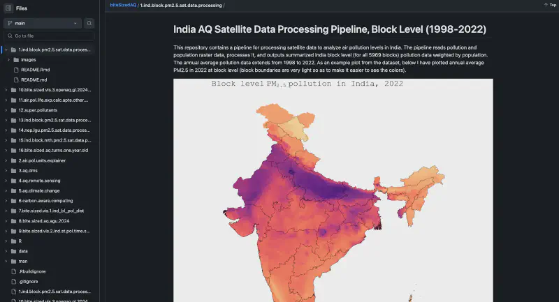
“When it comes to datasets, I look out for what data is ‘not out there’ and try to see if I can process it and make it open source. For example, biteSizedAQ’s first project was motivated by a need for block level PM2.5 estimates panel for India. But, I could not find such a granular dataset anywhere. In the past having produced similar datasets at district level, I decided to build on that work and process a fully documented India block level satellite derived PM2.5 dataset from 1998 to 2022, and then made the dataset alongside the data pipeline openly available on biteSizedAQ. Having pollution data for all of nearly 6000 Indian blocks, turned out to be a unique dataset that was of great use to the community, the feedback was really encouraging and that is the end goal.
By making both data and data pipelines openly available to the community, we equip the community with both the dataset and the skillset to generate and reproduce it themselves, which I find to be a very powerful combo.
Knowing that granular data could support more targeted policies for those regions, I decided to make the block level dataset and its pipelines publicly available on biteSizedAQ. This was biteSizedAQs first project and since then a next version of this dataset has also been released (1998 to 2023).”
Second, he focuses on topics that haven’t been covered at all. Subjects he can’t find clear explanations or consolidated resources for, even after thorough research. One example of this was when he was working on a blog post on carbon and grid aware computing.
“I couldn’t find a good, consolidated resource for one of my blog posts, which was about understanding the idea of carbon and grid aware computing and how we should evolve from carbon aware to grid aware for truly sustainable computing” Aarsh explained. “I was looking for material to build my own understanding, but everything was scattered. So I decided to bring it all together in one place and turn it into a biteSizedAQ blog post.”
As biteSizedAQ continues to grow, Aarsh has a few new directions in mind in terms of both content, and also how people engage with it.
More interactive interfaces: Upcoming projects may include open-source dashboards built on existing and external datasets, more visual explainers on the lines of biteSizedVisuals series and exploring more hands-on ways to explore air quality information (e.g. via LLM powered chatbots).
Website development: A dedicated website is being considered to make the platform more easier to navigate beyond its GitHub repository.
Community engagement: There are plans to introduce formats like interviews and podcasts that center community voices and create space for dialogue.
Broader scope: In addition to air quality, future work will continue to explore its intersections with climate change and other environmental variables, aiming for holistic solutions that address multiple environmental challenges together.
Together, these plans reflect a broader shift. One that keeps the core mission intact, while opening up new ways for people to connect, contribute, and learn through the platform.
Throughout our conversation, what stood out most was how biteSizedAQ bridges the gap between technical research and public understanding. It didn’t emerge from a campaign or a company goal, but from a practical need: clearer, more usable air quality data and related resources. That focus has shaped how the platform grows and how it invites others to engage with it.
As new tools, formats, and topics are introduced, biteSizedAQ remains grounded in the idea that fully open access to information can lead to more informed questions, conversations, and decisions.
If you’re curious to see it for yourself, head over to the biteSizedAQ GitHub and browse through the blog posts, datasets, or visual tools. Star the repo to keep track of upcoming projects or get in touch with Aarsh if you’d like to chat further or collaborate on something. It might just be the perfect thing to dig into for your next weekend project!
We design professional, accurate and long-lasting air quality monitors that are open-source and open-hardware so that you have full control on how you want to use the monitor.
Learn MoreCurious about upcoming webinars, company updates, and the latest air quality trends? Sign up for our weekly newsletter and get the inside scoop delivered straight to your inbox.
Join our Newsletter