Visualising air quality data for the public eye can be a complex task. While air pollution affects all of us, its impacts are not always tangible and its representation is abstract. How can we communicate to evoke emotional responses without using graphs or raw data?
At AirGradient, we caught up with Knitting the Air, a collective art project blending data, environmentalism, art and community to help make air quality data more tangible, digestible and accessible for the general public.
Origin of the project: From a monitor to an idea
Knitting the Air was founded two years ago by Caroline Murray. It all started with a Breathe London Community air quality monitor in east London which measures NO2 and PM2.5. Caroline says she “got obsessed with the data” and asked herself, “How can we help communities understand this data and make sense of it?”
This is where the knitting comes in. Knitting has a long history of data representation, and Knitting the Air drew inspiration from an initiative in the United States called Tempestry, whose large temperature blankets represent patterns of climate change. Caroline brought this forth to Poplar — a residential neighborhood in east London where air quality is a major challenge felt by the community. Tower Hamlets has the fifth worst air quality of any London borough. However, awareness and understanding remains low.
Knitting, knitting and more knitting…
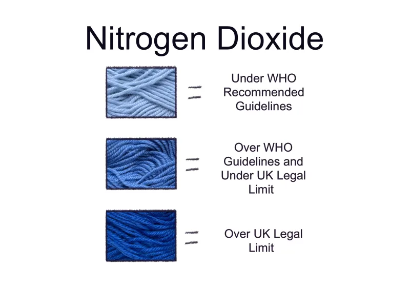
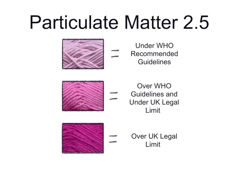
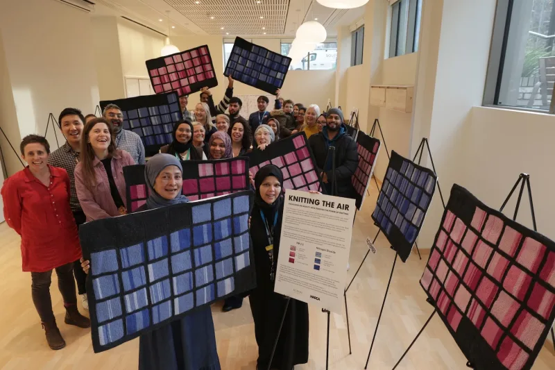
Using air quality data from two local sensors operated by the Breathe London Community, the knitting team crafted a pattern to color code the data. Each square represents a day, composed of 24 columns representing hourly averages of both NO2 and PM2.5 measurements. The shades of pink (PM 2.5) and blue (NO2) indicate how each reading relates to World Health Organisation guidelines and UK Legal targets.
‘At first I didn’t realise what the colours were saying. But then I realised I was knitting these dark colours. I’m getting sick of knitting in these dark colours. I wanna do light pink and light blue’ – Local Knitter
Knitting the Air set themselves the ambitious goal of knitting a whole years’ worth of data from these sensors, so they could explore how air quality changes with the seasons. This is a lot of knitting, totaling over 2000 individual squares.
Fortunately local knitters stepped up to the challenge, with more than 130 people contributing to knitting data. The knitters are a diverse group of volunteers from Poplar and the surrounding area, from curious neighbors to healthcare professionals, with ages ranging from 8 to 102 years old.
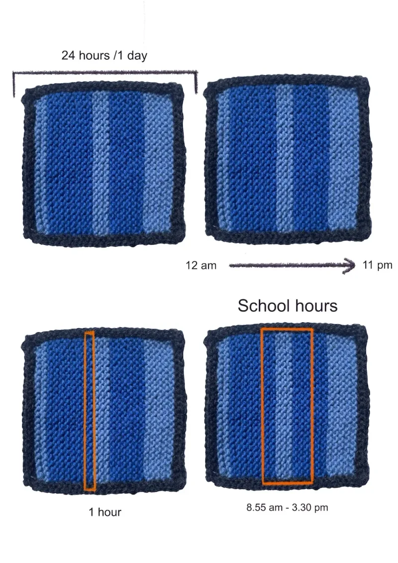
As the knitting grew, patterns in daily and seasonal NO2 and PM2.5 concentrations became more apparent. People could see spikes clearly and rush hour times were particularly detectable, as depicted in the above graphic. “It started to show patterns, and helped people connect what’s happening in the air with what’s going on in the world around them,” said Caroline.
'This is one of the best projects I’ve been involved in for a while. What a fantastic way to visualise air pollution, I’ve been involved in monitoring air quality in Poplar for many years and I’m excited how this project can help raise awareness’ – Local Knitter
‘I was astonished by the scale of this project and the input of so many people, of different ages, different backgrounds and different associations with Tower Hamlets...a knitting critical mass!’ – Local Knitter
Community Response
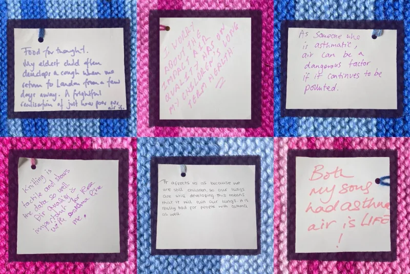
Knitting the Air has staged numerous pop up displays showcasing the knitting all across east London. From conversations with knitters and local residents, Knitting the Air has been collecting impressions and reactions from the community, asking the question ‘how does air affect us’. Profound and moving, people share what they worry about, what they hope for and a deep appreciation for air.
Caroline also shared with us how important it is for these kinds of projects to be led within the spaces and communities where the air quality is recorded. It is about creating links and closeness. The community members know exactly where the monitor is located and pass by it in their day-to-day lives. This way, they can better relate the data to their world and community.
"Knitting the Air has garnered an extraordinary response from the local community in Poplar, east London. Whether it’s helping to knit the data or sharing their lived experience of air pollution, communities have generously given their time, skill and stories to the project. We hope our collective work helps centre the dialogue about air quality on health and platform the voices of communities most affected by poor air."
What’s Next?
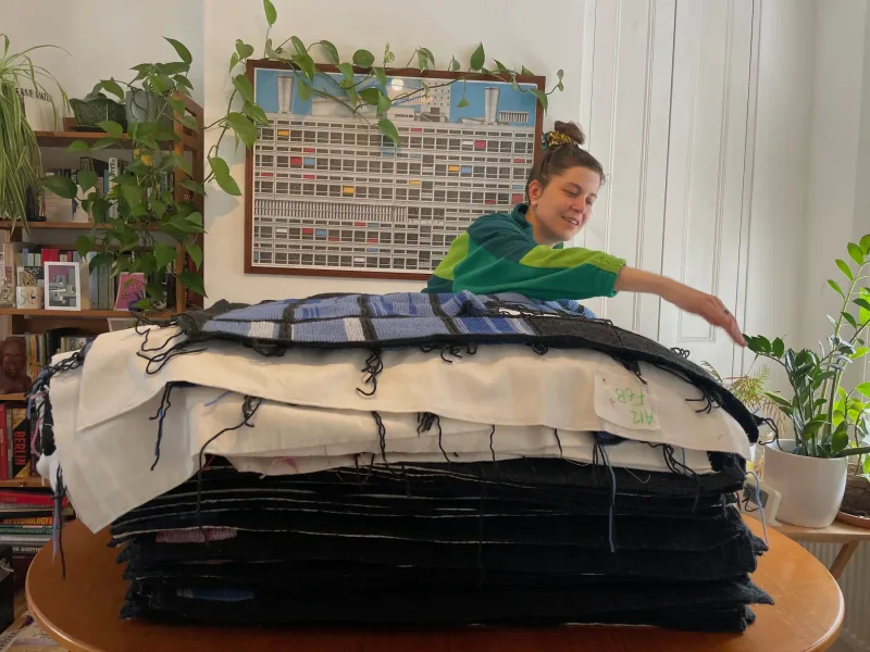
As of July this year the knitters completed their mission of knitting a year’s worth of data, which includes 52 panels of knitted squares that together extend over 12 metres in length.
This work will be revealed in September with the knitters and community who made it, alongside all the community reflections and feedback. The collective are also working on a public exhibition of the work in 2026, so as many people as possible can come and explore the knitting and learn about air quality in their area.
Check out Knitting the Air’s Instagram page (@knittingtheair) for more information and photos of the project, and stay tuned for updates on the work and their exhibitions.