Data Visualisation Analysis, and Interpretation
Understanding and managing air quality starts with the ability to see and interpret the data clearly. This chapter provides a hands-on guide to visualizing air quality data and making sense of what it means. Whether you’re tracking daily pollution patterns, comparing locations, or checking if the air meets safety standards, good visualization tools and smart analysis help turn raw numbers into real insights.
In Part I, you’ll learn how to use tools like time plots, maps, and scatter plots to explore your data visually. These tools are built into the AirGradient Dashboard and are essential for spotting trends, identifying unusual events, and understanding how air quality changes over time and space.
In Part II, we go deeper into data analysis and interpretation. You’ll learn how to find patterns in your data ( daily, weekly, seasonal), compare readings from different locations and understand how environmental factors like weather and traffic affect pollution. Finally, it explains how to compare your data to air quality standards to assess health risks.
Key Highlight
This chapter guides you through different visualisation methods to help you understand and make sense of your data. Furthermore, it helps you to put your data in a context in order to derive actionable conclusions.
PART 1: Visualizing Air Quality Data
Visualizing air quality (AQ) data through graphs helps identify patterns and communicate insights effectively. Here are some visualization methods:
1. Time plots
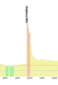
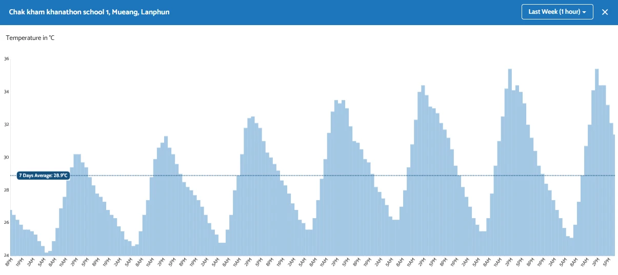
Time plots show how the air quality changes over time. It is useful to identify trends such as the continuous improvement or decline in air quality. It can also be used to identify patterns: maybe your neighbor enjoys a BBQ every Sunday, which might lead to poor air quality. See section 5 on how to identify trends and patterns.
1.1. Visualise Timeplots on the Dashboard
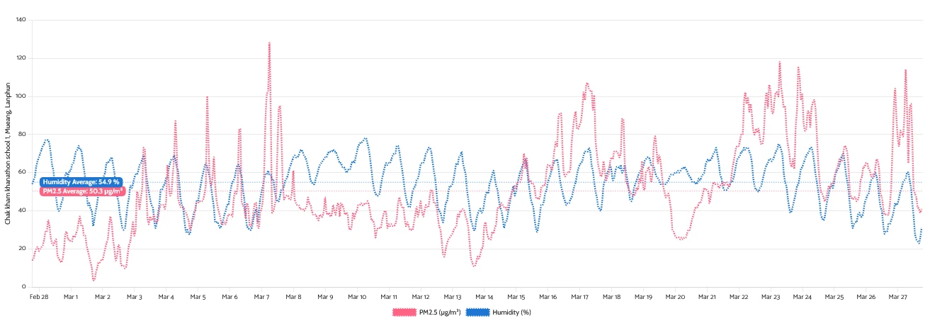
You can directly visualize timeplots of your air quality data on the dashboard. For example, a time plot will open when you click on the measured value of any monitor.
Example of a time plot visualised on the Dashboard:
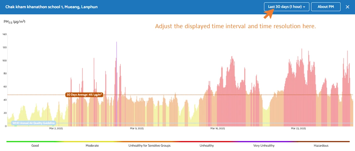
Color code: High PM2.5 values indicate an increased health risk. This risk is visualized in the Dashboard time plots using a color code based on the Ambient Air Quality Standards of the U.S. Environmental Protection Agency (EPA) and the air quality guidelines of the World Health Organization:

Additionally, you’ll see a horizontal line representing the target maximum concentration from the World Health Organization’s Air Quality Guidelines. Keep in mind that this WHO guideline refers to an annual average, while the Dashboard may display data over shorter time periods, such as daily values.
1.2. Adding notes to your Dashboard timeline
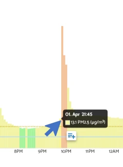
Sometimes, it is useful to save some information about events that might influence the readings of your sensor. For example, when a wildfire breaks out nearby, or your neighbour is having his Sunday BBQ.
Click on any point in the displayed time series to add a note. Then, a window will pop up where you can add the details of your event.
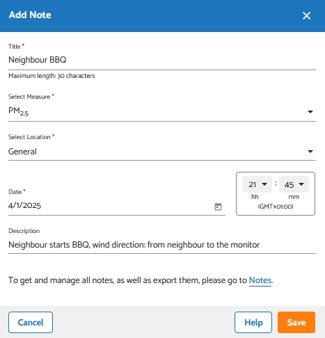
Once you have entered and saved the information, a note will appear on your timeline and in the “Notes” section, which you can reach via the hamburger menu on the left.

1.3. Visualise Timeplots via the Analytics function
Another way to display time plots in the Dashboard is to use the “Analytics” function.
In this function, you can customise the time period that you want to have displayed. The same data as shown above ( example graph for a timeline plotted by the Dashboard) looks like this in the Analytics feature:
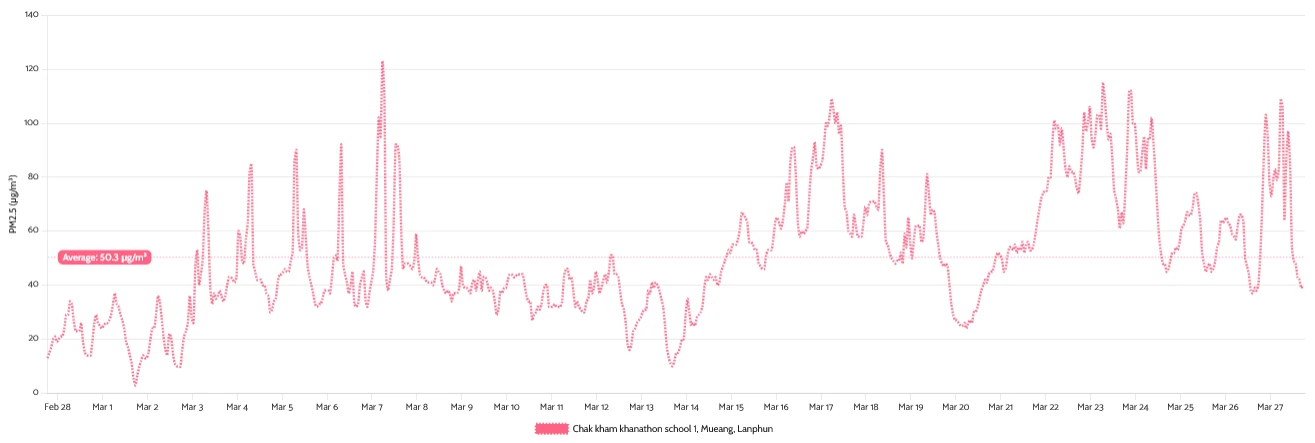
Instead of bars, a line is used to visualise the change in concentration. Both graphs present the same information, though.
Additional features of Analytics function:
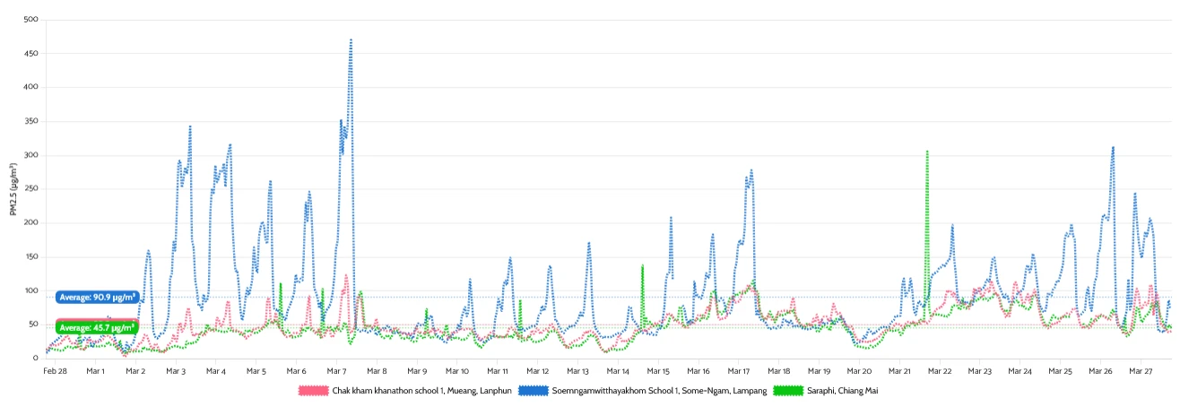
- Compare multiple monitors with each other.
In the “Single parameter mode” of the Analytics function (default mode), you can compare the measurements of multiple monitors ( as long as the same pollutant is selected). This can, for instance, be useful in comparing air pollution across different locations.
- Compare multiple parameters with each other.
In the “Multi parameter mode” of the Analytics function (switch button is in the top right corner), you can compare the measurements of different sensors (e.g. Temperature and PM) within one monitor. This is, for instance, useful to assess the impact of environmental factors like temperature on your readings.
1.4. Comparison: Dashboard vs. Analytics Visualization
| Feature | Dashboard Visualization | Analytics Visualization |
|---|---|---|
| Visualization Type | Time plots with bars, colour-coded based on EPA guidelines | Time plots with lines |
| Ease of Use | Quick & intuitive | More detailed & customizable |
| Customization | Pre-defined date ranges (Last 24h, 7 days, etc.) | Fully customizable date selection |
| Comparing Data | Not available | Compare multiple monitors (same pollutant) & multiple parameters (e.g., Temperature & PM) |
| Adding Notes | Users can add notes to specific data points | Not available |
| Best Use Case | Quick overview, identifying anomalies, tracking short-term trends | In-depth analysis, cross-monitor comparisons, multi-parameter correlation |
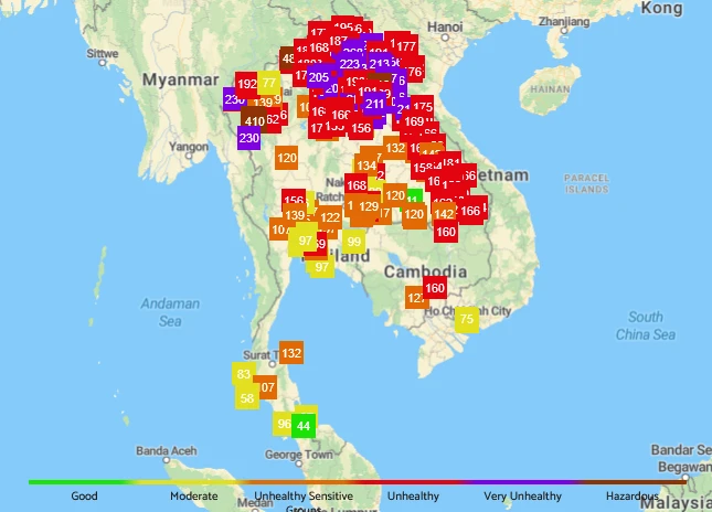
2. Air Quality Maps
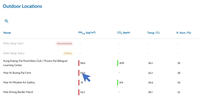
Air quality differs between different locations. This is best visualised on a map such as the Air Gradient map. It shows real-time outdoor air quality data, which is provided by members of the AirGradient community. Every square on the map corresponds to one monitor.
2.1. How to visualise your data in the map
If you have an outdoor monitor from AirGradient and would like to add your data to the AirGradient map, please follow the instructions in Chapter S7: Data Sharing.
Note that the indoor data cannot be displayed on the map, as the indoor air usually doesn’t depend as much on the geographical location as it depends on the emission sources in the building.
2.2. How to navigate the AirGradient map
The AirGradient map can be accessed on the homepage of the AirGradient website by clicking on the “Map” button.
A convenient way to navigate through the map is to use the mouse. The mouse wheel zooms in and out of the map. If you move the mouse while holding down the left mouse button, you can change the position on the map. Alternatively, you can also use the arrow keys on your keyboard to move left, right, up, and down. The “Plus” and “Minus” buttons in the top left-hand corner can be used to zoom in and out. The search bar in the top right-hand corner is helpful for finding specific locations, such as cities or countries.
Selection of data type
The map shows one of the data types below, based on what is currently selected by the user:
- PM2.5 µg/m3 (raw)
- PM2.5 µg/m3 (Correction Formula: EPA)
- PM2.5 US AQI (Correction Formula: EPA)
- CO2 ppm
The currently selected data type is stated in the top right-hand corner of the map. By clicking on that button, a drop-down menu will appear, which allows you to change the data type on the map.
Color code: Similar to the Dashboard, the colour code is based on the U.S. EPA and WHO guidelines to raise awareness about the health risks posed by the air pollution levels.
How to examine a specific location
If you are interested in a specific monitor at a certain location, you can click on the square of that monitor. A new window will open, which shows the measured values over time. The time range can be selected in the top right-hand corner.
Wind data
To the left of the search bar in the top right-hand corner is a button for showing and hiding real-time wind data. This can be helpful as the distribution of air pollutants depends greatly on the wind.
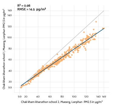
3. Scatter Plots
Scatter plots help explore the connection between two variables or monitors. Each point on the plot represents a pair of measurements taken at the same time. This visualization is often used for calibration—checking how closely a low-cost sensor follows a reference monitor—or for data quality assurance. If the points lie neatly along a line, that’s a good sign: it suggests a strong correlation. If the points are widely scattered, it may be necessary to find out why the two readings differ.
You can use the automatic calibration tool to create scatter plots on your dashboard. Go to Chapter S8 to find more information on this (Section 4.3: Automised Calibration Tool).
4. Advanced Visualisation methods
There are additional ways to visualize air quality data that can provide deeper insights (e.g. heat maps, box plots, histograms, or diurnal variation plots). These methods are more commonly used in research settings or by experienced analysts. If you’re curious to explore these techniques further, take a look at resources such as the R package “openAir” (an open-source tool specifically developed for the analysis of air quality data) or other specialized analysis tools. These can help uncover more detailed patterns, like how air quality changes by time of day or varies across different locations.
PART 2: Data Analysis and Interpretation
5. Identifying Trends Over Time
5.1. Daily Trends
Air quality often fluctuates throughout the day due to changes in human activity and environmental factors. For instance, in urban areas, pollution levels tend to spike during morning and evening rush hours due to increased vehicle emissions. Temperature differences between day and night also influence air quality: hotter daytime temperatures can increase ozone levels, while cooler nighttime temperatures can cause pollutants to settle closer to the ground, temporarily increasing concentrations.
5.2. Weekly Trends
Comparing weekdays and weekends can highlight the influence of traffic, industrial activity, and human behavior on air quality. In many cities, weekends tend to have lower pollution levels due to reduced commuting and industrial output.
5.3. Seasonal Patterns
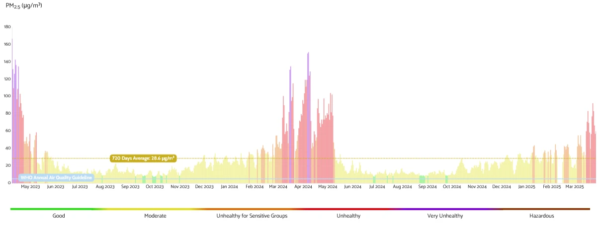
Long-term data reveals broader seasonal trends, often tied to weather conditions, agricultural practices, and regional events. For instance, in northern Thailand, particularly Chiang Mai, air quality deteriorates sharply during the dry season (March–May) due to widespread wildfires and agricultural burning — a period commonly referred to as the “wildfire season.” This seasonal phenomenon leads to prolonged periods of high PM2.5, often pushing air quality concentrations to unhealthy or hazardous levels.
6. Comparing Readings Across Locations
Analyzing AQ data across different locations helps reveal pollution hotspots, trace emission sources, and understand how geography and human activity shape air quality dynamics. These comparisons are critical for designing localized responses and understanding regional impacts.
6.1. Pollution Hotspots & Emission Sources
Some areas consistently show higher pollutant levels due to specific activities or geographic features. For instance, industrial zones often record elevated levels of air pollution due to emissions from manufacturing, power generation, or processing plants.
6.2. Weather Conditions
Air movement and temperature significantly affect pollution dispersion. Wind can help transport or dilute pollutants, improving air quality in downwind areas while potentially worsening it elsewhere. Temperature effects can trap pollutants close to the ground, causing localized spikes in PM2.5.
6.3. Urban vs. Rural Pollution
Urban areas usually face higher pollution levels due to dense traffic, construction, and population density. Rural zones may generally experience cleaner air, though they can still suffer from pollution due to agricultural burning or windblown smoke from distant sources.
6.4. Traffic Congestion
Areas near major roads and intersections show clear air quality degradation, which is linked to vehicle exhaust.
By comparing readings spatially, we can not only pinpoint areas at greatest risk but also detect how localized emissions can have wider regional impacts, aiding in both community-level and national-scale air quality management strategies.
7. Comparing Data to Air Quality Standards
To understand how bad or safe the air is, we need to compare air quality data to official air quality standards ( e.g. national standards like those from Thailand’s Pollution Control Department (PCD)) or guidelines (e.g. from the World Health Organization (WHO)). Note that National Standards may vary from country to country.
7.1. What Are Air Quality Standards?
Air quality standards define the maximum amount of pollutants — such as PM2.5, PM10, NO2, CO, or O3 — that can be present in the air before it becomes harmful to human health. These standards might differ across organisations and regions. For instance, the EPA recommends that annual average PM2.5 levels remain below 9 µg/m3, the WHO sets a stricter limit at 5 µg/m3, while Thailand’s national standard allows up to 15 µg/m3.
You can get a quick sense of how current air quality aligns with these standards by looking at the colour codes (based on EPA standards) and horizontal reference line (WHO limit) on the Dashboard. Just remember that while the standards are typically based on annual averages, the Dashboard may display data with shorter time resolutions, such as daily or hourly levels.
7.2. Why Compare to Standards?
By comparing the data, we can tell if the air is clean or polluted — and how dangerous it might be. If pollution levels go above the standard, it means the air may be unsafe, especially for children, the elderly, or people with health problems.
7.3. Short-Term vs. Long-Term Exposure
Some standards focus on short-term exposure (like over 24 hours), while others look at long-term exposure (like over a year). A single bad day may not break the yearly limit, but it can still be harmful in the short term.
8. Frequently Asked Questions (FAQs)
Why is it important to visualize air quality data?
Visualizing air quality data helps turn complex numerical information into clear insights, making it easier to detect trends, identify pollution events, and communicate risks effectively.
What tools are available in the AirGradient Dashboard for visualizing data?
The Dashboard offers tools such as time plots, scatter plots, maps, and the Analytics function, which allow for in-depth data exploration, trend analysis, and multi-monitor comparisons.
How do time plots help in understanding air quality?
Time plots show how air quality changes over time. They’re useful for spotting daily or seasonal patterns, detecting pollution spikes, and monitoring long-term trends.
Can I compare readings from different monitors or locations?
Yes, using the Analytics function in the Dashboard, you can compare multiple monitors across the same parameter or even compare different parameters from a single device.
What does the color coding in the Dashboard indicate?
The color coding follows U.S. EPA and WHO guidelines to represent the health impact of PM2.5 concentrations, helping users quickly assess air quality levels.
What’s the difference between Dashboard visualizations and the Analytics function?
The Dashboard provides a fast, intuitive view with color-coded bar charts, while the Analytics tool allows for deeper analysis with customizable date ranges, line plots, and multi-monitor or multi-parameter comparisons.
How can I note special events like wildfires or BBQs that might affect air quality?
You can add notes directly to your time plots on the Dashboard by clicking a data point and entering event details. This helps explain anomalies in your data.
How are air quality maps useful?
Maps show spatial variations in air quality. They help you understand how pollution differs across locations and are particularly helpful for identifying regional pollution patterns.
What is a scatter plot used for in air quality analysis?
Scatter plots show the relationship between two variables, like comparing a low-cost sensor to a reference monitor. They are essential for calibration and quality assurance.
How do I know if air quality is safe?
By comparing your data to air quality standards from the EPA, WHO, or national agencies, you can determine if pollutant levels are within safe limits and assess associated health risks.
9. Links to Additional Third-Party Information
9.1. Recommended Free Analysis Tools
- Excel/Google Sheets: Basic data analysis and chart creation.
- OpenAQ (https://openaq.org): Access global AQ data.
- QGIS (https://qgis.org): Free GIS software for mapping AQ data.
- Python (Pandas, Matplotlib, Seaborn): For advanced analysis and visualization.
9.2. Further Reading on Air Quality Standards and Best Practices
9.3. Contacts for Expert Consultation
- Local Universities: Environmental science departments often offer collaboration.
- Government Environmental Agencies: Can provide guidance on AQ monitoring.
- NGOs & Advocacy Groups: Groups like Greenpeace and local clean air initiatives may have expertise in AQ data interpretation.
Developed by AirGradient in Collaboration with the UNDP Global Centre Singapore CC-BY-SA