Air pollution makes headlines often enough. What gets less attention is the granular picture underneath: which countries are bearing the heaviest burden, what is actually driving the pollution in each region, and what decades of exposure mean for human health. There are, of course, numerous studies and reports that help us understand this, but the UNEP Pollution Action Note takes this one step further by creating visualisations that help us see that picture clearly, all while being free to use.
Developed and funded by the Climate and Clean Air Coalition, the tool covers the current state of PM2.5 and ground-level ozone exposure worldwide, the sectors responsible for driving that pollution globally and by region, the health burden linked to exposure, and the international agreements countries have signed in response. The data behind each of these comes from carefully built research in the field: exposure levels and health outcomes are drawn from the Health Effects Institute's State of Global Air report, grounded in the Global Burden of Disease study. The sector breakdown comes from the Global Burden of Disease from Major Air Pollution Sources (GBD MAPS) research, a body of work that produced the first comprehensive global estimates of how specific pollution sources – categorised by sector and fuel type – contribute to PM2.5 exposure and disease burden at global, regional, and national scales. The tool’s contribution is in the visualisation: taking years of that work and turning it into a single interactive interface that anyone can filter and explore.
Beginning with the numbers
The UNEP Pollution Action Note starts off by showing that 99% of the world’s population was living in areas that exceeded the World Health Organization’s annual PM2.5 guideline of 5 µg/m³ in 2023. It maps where each country currently sits relative to that standard and the interim targets the WHO set for countries on the way there, which gives you a more nuanced picture of the overall situation rather than the assumption that a country is passing or failing.
What's also worth noting is how clearly the tool shows that PM2.5 does not stay where it originates. By including a graphic on PM2.5 concentrations, it shows us that fine particles can travel hundreds or thousands of kilometers depending on wind and atmospheric conditions, which means that pollution generated in one country regularly affects air quality well beyond its borders. On the other hand, stagnant air can cause particles to accumulate and affect areas right by the source. Ground-level ozone behaves in a similar way, forming through chemical reactions between precursor pollutants in sunlight before drifting across regions. It is worth mentioning that the tool tracks both pollutants separately throughout, because they have different sources, behaviour in the atmosphere, and health consequences.
Where the pollution comes from
The source attribution section of this site is one of the more immediately useful sections for anyone trying to understand what is actually driving the numbers in a specific context. Built on the GBD MAPS research, it lets you hover over individual sectors to see their share of total PM2.5 concentration, turning a detailed modeling dataset into something you can read at a glance.
The pollution note gives an overview of the problem both on a global and a more local scale. A separate regional graphic right below shows how those proportions shift depending on which region you look at. In parts of Africa, for instance, windblown dust dominates in a way that reflects geography as much as it does human activity, a distinction that is easy to miss without seeing the data laid out regionally like this.
What exposure means in health terms
The health section opens on a global map where country squares are sized by total deaths attributed to fine particle pollution or ozone. From there, it narrows down to show the percentage of deaths from specific conditions such as stroke, heart disease, and lung cancer are attributable to both PM2.5 and ozone exposure, country by country.
There is also an interactive layer that lets you select a specific disease and see which countries carry the heaviest proportional burden for that condition. Seeing those conditions listed against a single environmental exposure is a reminder of how far the effects of polluted air reach into the body, and how unevenly that burden is distributed across the world.
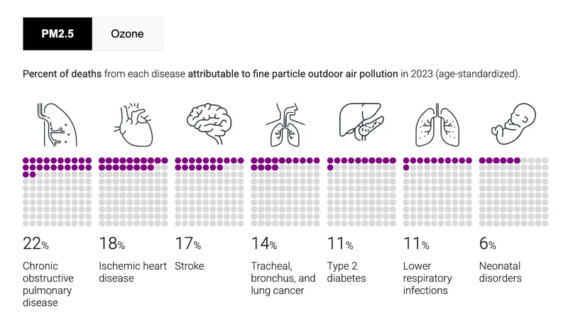
Long-term ozone exposure is currently quantifiable for Chronic Obstructive Pulmonary Disease (COPD) specifically, and the tool reflects that limitation honestly rather than overstating what the data can show. That kind of transparency about the boundaries of the evidence is not always a given in public-facing tools, and it matters.
The policy layer
After it walks through the scale of the problem and its health consequences, the tool turns to a question that is often easy to underlook: what is being done? The policy section – drawing on a global report developed by UNEP – shows which international air quality agreements each country has signed, with 95% of the world’s population currently living in a country that is party to at least one. Hovering over a country surfaces its specific commitments, and a set of zoomed-out maps at the bottom shows each agreement's reach, distinguishing between full participants and observers, with direct links to the agreements themselves.
That 95% figure, set alongside the 99% of people still breathing air that exceeds WHO guidelines, is not a contradiction so much as an honest picture of where things stand. While significant commitments have been made, there is still a considerable distance to travel.
At the end of all of this, the tool offers a country search that pulls everything together into a single downloadable profile. Annual mean PM2.5 as a multiple of the WHO guideline, the disease breakdown, sector contributions, policy commitments all shown in one place, for any country you want to look at. It is a genuinely useful starting point for country-level research, and the kind of synthesis that usually requires pulling from several separate reports to put together.
Why this kind of access matters
As mentioned earlier, there is an enormous amount of good research on air pollution, built carefully over years by researchers and institutions working at a global scale. What UNEP’s Pollution Action Note offers is a way to engage with that research directly, presented in a form that anyone ranging from a researcher to a curious reader can sit down with and understand.
The tool is publicly accessible and free to use. You can find it at www.unep.org/interactives/pollution-action-note
Sources
- Actions on Air Quality: A Global Summary of Policies and Programmes to Reduce Air Pollution. UNEP, 2021.
- Health Effects Institute. 2025. State of Global Air 2025. www.stateofglobalair.org.
- McDuffie et al., Global Burden of Disease from Major Air Pollution Sources (GBD MAPS): A Global Approach.
- McDuffie, E.E., Martin, R.V., Spadaro, J.V. et al. Source sector and fuel contributions to ambient PM2.5 and attributable mortality across multiple spatial scales. Nat Commun 12, 3594 (2021)