AirGradient Dashboard: Measurements and Interpretation
AirGradient Dashboard: Measurements and Interpretation
The AirGradient Dashboard displays measurements reported by AirGradient monitors and stores them so you can review changes over time.
All AirGradient monitors can send data to the Dashboard. The available measurements depend on the monitor model, its installed sensors, and how it is connected.
Set up a monitor with the Dashboard
Use the setup guide for your monitor:
| Monitor | Dashboard setup guide |
|---|---|
| AirGradient ONE | Registering Your AirGradient ONE on the AirGradient Dashboard |
| AirGradient Open Air | Registering Your AirGradient Open Air on the AirGradient Dashboard |
| AirGradient Open Air Max | AirGradient Open Air Max: Adding to the Dashboard |
| AirGradient Go | Start with the AirGradient Go Quick Start Guide |
The monitor must be registered to a Dashboard Location before data will appear.
What are Places and Locations in the AirGradient Dashboard?
What you can see in the Dashboard
Parameters shown by default

| Measurement | Unit or scale | What it tells you | Why this unit or scale is used |
|---|---|---|---|
| PM2.5 | µg/m³ | The estimated mass concentration of fine particles | µg/m³ expresses particle mass in a volume of air and is used by most air-quality guidelines. US AQI converts the concentration into a public communication scale. |
| CO2 | ppm | Carbon dioxide concentration | CO2 is shown in parts per million (ppm). This unit expresses gas concentration by volume and is the standard way to track CO2. |
| Temperature | °C or °F | Air temperature near the monitor | Celsius and Fahrenheit are familiar physical temperature units. |
| R. Humidity | % RH | Relative humidity near the monitor | % RH compares the water vapour in the air with the maximum the air could hold at the same temperature. |
| TVOC (Ind40) | Unitless index (1-500) | Changes in volatile organic compound activity | A relative index is used because the broad-response sensor detects changes in VOC mixtures rather than an exact concentration of each chemical. |
| NOx (Ind41) | Unitless index (1-500) | Changes in oxidising-gas activity | A relative index is used because the sensor responds broadly to oxidising gases rather than measuring a specific gas concentration. |
| Last Update | Date and time | When the Dashboard last received data from the monitor | A timestamp makes it possible to distinguish a current reading from old or interrupted data. |
Wi-Fi connected monitors update every minute in the dashboard. Cellular models can update anywhere from 3 minutes to 9 minutes. |
Of the particle measurements, PM2.5 is shown by default as it is the most widely used particle measurement for health guidance and air-quality comparisons.
Measurements available through Advanced Configuration Settings
Advanced Configuration Settings make additional measurements available for selection. The exact list depends on the monitor model and its sensor configuration.
Enable Advanced Configuration Settings
To make advanced measurements available:
Open General Settings in the sidebar menu of the Dashboard.
Scroll down.
Enable Show Advanced Configuration Settings.
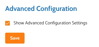
Select Save.
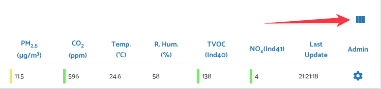
Return to the Dashboard. PM1, PM10 and PM0.3 will already be displayed. Select the additional measurements you want to show by using the bars icon on the right:
| Measurement | Unit or scale | What it shows and why |
|---|---|---|
| PM0.3 Count | Particles per dL | Number of detected particles at or above approximately 0.3 µm in one decilitre of sampled air. The count is useful when many small particles contribute little mass especially in very clean air. |
| PM1 | µg/m³ | Estimated mass of particles up to approximately 1 µm in a cubic metre of air. |
| PM10 | µg/m³ | Estimated mass of particles up to approximately 10 µm in a cubic metre of air. |
| Heat | °C or °F | Heat Index: Calculated apparent temperature combining corrected temperature and humidity. Calculated feels-like temperature. A temperature unit is used because the result describes apparent temperature. |
| GO AQS (indoor only) | 0-10 | A user-friendly integer score from 10 (best) to 0 (worst) combining PM and CO2 readings. For more details, see GO IAQS Score Simulator |
| TVOC | ppb | Ethanol-equivalent estimate calculated from the TVOC Index using the sensor manufacturer’s conversion formula. It is shown in parts per billion but it is not a direct concentration of every VOC and still not an absolute concentration. |
| TVOC | ticks | TVOC Raw log(R): Logarithmic raw resistance output from the MOx sensor. |
| NOx | ticks | NOx Raw log(R): Logarithmic raw resistance from the NOx MOx sensor. Resistance increases in presence of oxidizing gases such as NOx. |
| Battery Voltage (Open Air Max and Go only) | Volt | Electrical potential of the Open Air Max battery. |
| Solar Panel Voltage (Open Air Max only) | Volt | Electrical potential supplied by the Open Air Max solar panel. |
| Signal Strength | dBm | WiFi/cellular signal strength, shown as a negative number. A value closer to 0 means a stronger received signal: -55 dBm is stronger than -75 dBm. Useful to check the ideal location for installation. |
Other measurements may appear when supported by a particular monitor or sensor configuration.
For the complete and more technical list of measurements reported (including raw and corrected data),see What parameters do AirGradient monitors measure?.
Before interpreting a reading
Check these four details first:
- Parameter: Confirm what is being measured.
- Unit: For example, PM2.5 in µg/m³ is different from PM2.5 shown as US AQI.
- Location: An indoor reading can have a different meaning from an outdoor reading.
- Time period: A current reading, a five-minute average, and a daily average answer different questions.
PM1, PM2.5, PM10, and PM0.3 particle count
Particulate matter, or PM, is a mixture of solid particles and liquid droplets suspended in the air. For more detailed guidance see: Particulate Matter (PM) Basics by US EPA
Additional resources:
Beyond the Numbers series: The Uncomfortable Complexity of PM2.5
PM1, PM2.5, and PM10 measure particle mass
PM1, PM2.5, and PM10 are mass-concentration measurements. They are shown in micrograms per cubic metre (µg/m³).
A microgram is one-millionth of a gram, and a cubic metre describes the volume of air. The unit therefore answers: How much estimated particle mass is present in this volume of air? It does not report how many individual particles were detected.
| Measurement | What it represents | How to use it |
|---|---|---|
| PM2.5 | Estimated mass of fine particles up to approximately 2.5 µm | Use as the main particle measurement for air-quality guidance and comparisons. |
| PM1 | Estimated mass of particles up to approximately 1 µm | Follow changes in the smallest reported particle fraction. There is no widely used separate PM1 air-quality guideline. |
| PM10 | Estimated mass of particles up to approximately 10 µm | Used to follow changes involving larger particles such as dust. Optical sensors are generally less reliable for the largest particles. |
For context on the sizes, see the image below:

These measurements overlap. PM2.5 includes the PM1 fraction, and PM10 includes the smaller PM fractions.
Indoor PM can rise because of cooking, smoke, candles, cleaning, dust, or outdoor pollution entering the building. Outdoor PM can change because of traffic, smoke, dust, industry, construction, weather, and wind direction.
The dashboard shows PM2.5 by default because it is the most useful and accurate mass-concentration metric reported by Plantower PM sensors and is the PM value most commonly used in health guidance and air-quality comparisons.
Why? Because our monitors are primarily calibrated and tested for PM2.5 readings. PM1 is often very close to PM2.5, so showing both by default can add repetition without adding much information. The PM2.5 measurement also includes the PM1 fraction.
PM10, on the other hand, can be less reliable when the air contains larger particles, such as dust or sand, because low-cost optical sensors may not detect those particles as consistently.
We therefore focus the main dashboard view on the particle measurement that has the strongest health and regulatory context and the most useful calibration support. PM1 and PM10 remain available for users who need them, but should be interpreted with their limitations in mind. See They Add More Pollutants; We Add More Accuracy. Why We're Stepping Back from PM1 and PM10 Marketing for the reasoning behind this approach.
PM0.3 is a particle count
PM0.3 particle count reports the number of detected particles at or above approximately 0.3 µm. It is shown as particles per decilitre (per dL), not as particle mass. One decilitre is 0.1 litre, so the unit standardizes the count to a defined volume of sampled air.
Particle mass and particle count can move differently:
- Many very small particles can create a high count while contributing relatively little mass.
- A smaller number of larger particles can contribute more mass.
- Particle count cannot be converted directly into PM2.5 mass without assumptions about particle size, shape, and density.
At very low particle concentrations, PM1, PM2.5, or PM10 may appear as 0 or near zero while the sensor still detects a small particle count. In this situation, PM0.3 count can provide additional evidence that some particles are still present.
There is no health category for PM0.3 count.
PM2.5 breakpoints and color codes in µg/m³
When PM2.5 is displayed as mass concentration, the Dashboard uses:
| Color | PM2.5 |
|---|---|
| ● Green | Up to 9 µg/m³ |
| ● Yellow | Above 9 and up to 35.4 µg/m³ |
| ● Orange | Above 35.4 and up to 55.4 µg/m³ |
| ● Red | Above 55.4 and up to 125.4 µg/m³ |
| ● Purple | Above 125.4 and up to 225.4 µg/m³ |
| ● Brown | Above 225.4 µg/m³ |
The WHO PM2.5 guideline values are 15 µg/m³ for a 24-hour average and 5 µg/m³ for an annual average. These are not thresholds for one instant reading. Compare guidance with a Dashboard average covering the same period.
PM2.5 breakpoints and color codes in US AQI
The Dashboard can also show PM2.5 as US AQI instead of µg/m³.
US AQI is a calculated index, not another sensor measurement. PM2.5 µg/m³ concentration is a physical measurement of the particles in the air. An AQI converts that concentration into a simplified scale intended to communicate potential health risks. See more about US AQI here: Air Quality Index (AQI) Basics
Check the unit before comparing values between other sources. For example, 35 µg/m³ and an AQI of 35 do not describe the same air condition. AQI formulas and breakpoints can also differ between countries, so confirm that another service is using US AQI before comparing its number with the Dashboard.
US AirNow AQI Calculator: A calculator for converting pollutant concentrations into values on the US Air Quality Index.
To change the PM2.5 unit to US AQI in the dashboard:
- Open the toggle by clicking the hamburger menu in the top right corner of the dashboard:
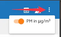
- Click on the toggle.
The PM2.5 values and graphs will then use US AQI:
| Color | US AQI | Category |
|---|---|---|
| ● Green | 0-50 | Good |
| ● Yellow | 51-100 | Moderate |
| ● Orange | 101-150 | Unhealthy for sensitive groups |
| ● Red | 151-200 | Unhealthy |
| ● Purple | 201-300 | Very unhealthy |
| ● Brown | Above 300 | Hazardous |
How to read a PM graph
The x-axis shows time. The y-axis shows the PM2.5 level in the selected unit, either µg/m³ or US AQI.
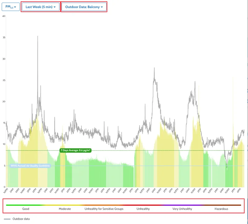
Use the controls to choose the time range and averaging interval. A shorter interval shows brief changes more clearly, while a longer interval smooths short spikes and makes longer-term patterns easier to see.
The graph includes:
- colored bars for the selected monitor's PM2.5 readings
- a dotted line showing the average for the selected time range
- a line showing the WHO annual PM2.5 air-quality guideline of 5 µg/m³
- a grey outdoor-data line when an outdoor monitor is selected for comparison
If you have an outdoor monitor, you can select it under Outdoor Data to place its readings over the indoor graph. This can help you see whether an indoor rise coincides with outdoor pollution or is more likely to come from an indoor activity.
The colors of the bars follow the Dashboard's PM2.5 breakpoints.
Look at the shape and duration of the pattern:
- A short indoor spike may coincide with cooking, smoke, cleaning, or disturbed dust.
- A repeated spike at a similar time may point to a regular activity, traffic period, or ventilation schedule.
- A sustained rise may indicate an ongoing source or outdoor pollution entering the building.
- Nearby outdoor monitors can differ because PM is local and affected by wind, roads, buildings, terrain, and distance from a source.
Compare averages with the correct guideline
The WHO guideline line at 5 µg/m³ is an annual mean guideline, not a threshold for an individual reading or short event. The WHO also publishes a 15 µg/m³ 24-hour mean guideline for PM2.5.
Always compare like with like:
- compare a 24-hour average with a 24-hour guideline
- compare an annual average with an annual guideline
Choose a time range and averaging interval that match the question you are investigating. Short intervals are useful for finding events and sources. Daily or longer averages are more appropriate when comparing exposure patterns with health-based air-quality guidance.
The WHO values apply to ambient outdoor air over defined averaging periods. They are useful context for indoor measurements, but they are not short-term indoor event limits.
For information about how PM calibration affects the displayed PM2.5 value, see Particulate Matter (PM) Sensor Calibration Guide.
Carbon dioxide
Carbon dioxide (CO2) is a gas found in the air around us. The most common source of CO2 indoors is people who breathe it out. If a room is well ventilated, CO2 levels are usually much lower. Because of this, CO2 is a good indication of the ventilation each person might be experiencing: with higher CO2 levels showing an increase in stale air and a lack of fresh air supplied to the room.
CO2 is shown in parts per million (ppm). For example, 1,000 ppm means approximately 1,000 CO2 molecules for every one million air molecules. This unit is used because CO2 is a gas concentration rather than a particle mass.
More resources:
The Hidden Health Risks of CO2: Rethinking Acceptable Exposure Limits
Low Cost CO2 Sensors Comparison: Photo-Acoustic vs NDIR
Can a CO2 sensor built for your living room hold up on a farm?
Interpreting CO2 indoors
Indoors, people exhale CO2. A rising or sustained CO2 level in an occupied room usually means that outdoor-air ventilation is not keeping up with occupancy.
A well-ventilated space should have CO2 concentrations below 800 ppm. If the reading is between 800 and 1500 ppm, the room is potentially stuffy and steps could be taken to improve the ventilation to the room.
Consistent readings above 1500 ppm could indicate that the ventilation needs improving but even at this level, CO2 is not itself dangerous to our health, it is very different to poisonous gases, such as carbon monoxide. However, lower CO2 levels have been shown to help with maintaining cognitive functions.
The Dashboard uses these categories:
| CO2 | Color | Dashboard category | Recommendation |
|---|---|---|---|
| Below 801 ppm | ● Green | Excellent | Maintain levels of occupancy, ventilation and air filtration |
| 801-1,000 ppm | ● Yellow | Acceptable | Mild cognitive effects with potential increase in fatigue and headaches. Generally safe for most individuals. Ensure adequate ventilation and monitor CO₂ levels. |
| 1,001-1,500 ppm | ● Orange | Not Ideal | Noticeable cognitive decline, early signs of physiological stress. Increase ventilation and introduce CO₂ scrubbing strategies. |
| 1,501-2,000 ppm | ● Red | To be avoided | Metabolic and cardiovascular stress markers increase. Increased risk of respiratory symptoms in children. Increase ventilation and introduce CO₂ scrubbing options. |
| 2,001-3,000 ppm | ● Purple | Unhealthy | Noticeable cognitive decline, early signs of physiological stress. Increase ventilation and introduce CO₂ scrubbing strategies. |
| Above 3,000 ppm | ● Brown | Very Unhealthy | Immediate Ventilation improvements required. |
Interpreting CO2 outdoors
Outdoors, CO2 is environmental data rather than an indicator of room ventilation. The typical concentration of CO2 outdoors is around 428 ppm although it can be higher in cities. For more information about background CO2 levels and how they have changed over time, see NASA's climate pages.
Local outdoor readings can be affected by combustion sources, vehicle or building exhaust, plant activity, weather, pressure, and atmospheric mixing. See EPA Guidance on CO2 emissions.
Some use cases for outdoor CO2 data are:
- Placing a CO2 sensor near a busy road before and after a speed limit
- Detecting idling cars or buses at car parks or in front of schools
- Identifying local CO2 impacts from decomposition and wildfires
- Identify local emission sources (e.g. power plants)
How to read a CO2 graph
The x-axis shows time. The y-axis shows the CO2 concentration in ppm. Use the controls of the graph to choose the time range and averaging interval.
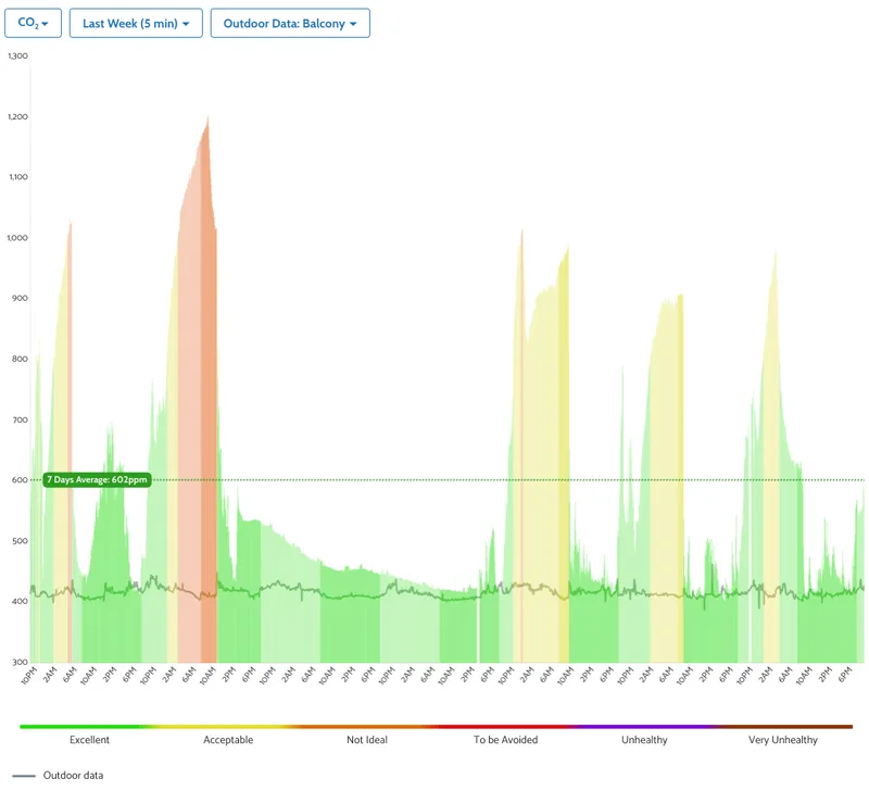
A shorter interval shows quick changes more clearly, while a longer interval smooths brief changes and makes daily or repeated patterns easier to see.
The graph includes:
colored bars showing the selected monitor’s CO2 readings
a dotted line showing the average CO2 level for the selected time range
an outdoor-data line when an outdoor monitor is selected for comparison
The colors of the bars follow the Dashboard's CO2 categories shown above.
For an indoor monitor, compare the graph with occupancy and ventilation:
A rise after people enter usually shows that CO2 is accumulating faster than ventilation removes it.
A fall after a window is opened or outdoor-air ventilation increases shows that more outdoor air is reaching the room.
A repeated daily pattern can reveal whether ventilation schedules match occupancy.
A high value that continues after the room is empty may justify checking ventilation and monitor placement.
If you have an outdoor monitor, select it under “Outdoor Data” to place its readings over the indoor graph. The difference between the two lines provides useful ventilation context.
Choose the time range and averaging interval for the question you are investigating:
use a short interval to see when CO2 begins rising or how quickly it falls after ventilation changes
use a longer interval to compare occupied and unoccupied periods or find repeated daily patterns
remember that a longer average can hide short peaks
TVOC and NOx
Volatile organic compounds (VOCs, the 'T' stands for 'total' in recognition of the fact that the monitors are designed to detect all VOCs). VOCs encompass a wide variety of things, and not all of these are equally harmful, or even inherently harmful. To accurately assess any risk within, you would need to identify every single compound in the air, and its level everywhere at all times. These low cost VOC sensors (indeed, even the latest and greatest scientific equipment!) cannot do that.
TVOC and NOx Index readings come from the same sensor. Due to their limitations, they are most useful for identifying trends, changes and repeatable events. They do not identify a specific chemical or directly describe its toxicity. They are also not absolute measurements. For more information see:
Explaining VOCs, TVOC and the VOC Index
TVOC - When it's useful and when it's useless
How Accurate is the Sensirion SGP41 TVOC Sensor?
TVOC (Ind40)
The TVOC Index is unitless. The 40 in Ind40 refers to the sensor which first introduced the TVOC index, the Sensirion SGP40. It compares current volatile organic compound activity with the sensor's recent baseline (12 hours by default) rather than claiming an exact concentration:
- Around 100 represents the recent baseline.
- Below 100 indicates less VOC activity than the recent baseline.
- Above 100 indicates more VOC activity than the recent baseline.
The Dashboard uses these TVOC Index breakpoints and colors:
| Color | TVOC Index |
|---|---|
| ● Green | Up to 150 |
| ● Yellow | Above 150 and up to 250 |
| ● Orange | Above 250 and up to 400 |
| ● Red | Above 400 |
So what good are the TVOC measurements? Since this is relative readings and the sensor cannot provide absolute values, we suggest that, for each space you investigate, you can look at periods of time when the TVOC measurements are relatively low or high and consider what might have caused that. Look especially for short 'spikes' in the TVOC data and have a think about what might be happening within the space at, or just before. Cleaning products, fragrances, paint, furniture, cooking, smoke, and other sources can change the index. Look for a connection between a Dashboard spike and an activity or product.
There is no universal health threshold for the TVOC Index and due to the baselining behaviour a high VOC environment can also gradually become the new baseline, so the index can return toward 100 while the source remains present.
This measurement is thus best used to identify changes and investigate sources.
TVOC in ppb
The Dashboard may also show a TVOC value in parts per billion (ppb). This is an ethanol-equivalent estimate calculated from the TVOC Index using the below formula provided by the sensor manufacturer, Sensirion:
TVOC_ethanol [ppb] = -381.97 * (ln(501 - VOC_Index) - 6.24)
From Compliance of Sensirion’s VOC Sensors with Building Standards
Again, this is not a direct measurement of the total concentration of every VOC.
The Dashboard uses the following breakpoints and colors:
| Color | TVOC |
|---|---|
| ● Green | Up to 44 ppb |
| ● Yellow | Above 44 and up to 111 ppb |
| ● Orange | Above 111 and up to 222 ppb |
| ● Red | Above 222 and up to 2,222 ppb |
| ● Purple | Above 2,222 and up to 22,222 ppb |
| ● Brown | Above 22,222 ppb |
NOx (Ind41)
The NOx Index is also unitless. The 41 in Ind41 refers to the sensor which first introduced the TVOC index, the Sensirion SGP41. It is a relative signal for oxidising-gas activity rather than a direct concentration:
- Around 1 represents the baseline.
- Values above 1 indicate increased oxidising-gas activity compared with the baseline.
The Dashboard uses the following breakpoints and colors:
| Color | NOx Index |
|---|---|
| ● Green | Up to 20 |
| ● Yellow | Above 20 and up to 150 |
| ● Orange | Above 150 and up to 300 |
| ● Red | Above 300 |
Just like the TVOC Index, the NOx Index is not a direct measurement of NO2 in ppb or µg/m³. Do not compare it with a regulatory NO2 limit.
See: The SGP41 Detects NOx Events, But Can You Trust the Number?
AirGradient testing also found that the NOx Index should not be used as a reliable ambient outdoor NO2 measurement.
See Why the SGP41 Can't Measure Ambient NOx for the outdoor test results and limitations.
TVOC (ticks) and NOx (ticks)
TVOC (ticks) and NOx (ticks) are the raw digital signals from the Sensirion SGP41 sensor. They are called ticks: because the sensor reports them as digital counts rather than in a physical concentration unit.
TVOC (ticks) is TVOC Raw log(R), a value proportional to the logarithm of the VOC sensing element's resistance.
NOx (ticks) is NOx Raw log(R), a value proportional to the logarithm of the NOx sensing element's resistance. Its resistance increases in the presence of oxidising gases such as NOx.
Sensirion's gas-index algorithm processes these raw signals to produce the TVOC Index and NOx Index. For normal Dashboard use, interpret the index values rather than the ticks. Raw ticks are mainly useful for diagnostics, sensor evaluation, and specialist analysis; they must not be compared with pollutant guidelines or treated as direct VOC or NO2 concentrations.
See the Sensirion SGP41 datasheet for the raw-signal definition.
How to read TVOC and NOx graphs
Treat these graphs as source-finding tools:
- Look for changes from the normal baseline for that location.
- Match spikes with cleaning, fragrances, cooking, smoke, combustion, traffic, or newly introduced materials.
- Look for repeated patterns rather than assigning meaning to one isolated point.
- Remember that a TVOC or NOx Index does not identify a specific gas or its concentration.
Temperature, humidity, and Heat Index
Temperature
Temperature is the air temperature near the monitor, shown in °C or °F. You can switch between the units in General Settings > Place > Temperature Unit.
For the indoor monitor, use it to understand local room conditions. Direct sunlight, nearby heat sources, electronics, airflow, enclosure heat, condensation, direct water exposure, and the monitor being held in a person's hand can all change the readings.
For outdoor monitors, these values may differ from ambient conditions because the sensor is inside the enclosure. For correction and installation guidance, see Temperature/Humidity Sensor Calibration Guide.
Humidity
Humidity is shown as relative humidity (% RH). It describes how much water vapour is in the air relative to the maximum amount the air could hold at that temperature.
For example, 50% RH means the air contains about half the water vapour it could hold at the same temperature. Because the maximum changes with temperature, relative humidity should be interpreted together with temperature.
Heat Index
Heat Index is a calculated feels-like temperature based on temperature and relative humidity. It is not measured by a separate sensor. For more information see: Heat index - Wikipedia
It is shown in °C or °F because the result describes an apparent temperature. The unit follows the selected Dashboard temperature unit.
The Dashboard Heat Index colors use these values in °C:
| Color | Heat Index |
|---|---|
| ● Green | Up to 32 °C |
| ● Yellow | Above 32 and up to 40 °C |
| ● Orange | Above 40 and up to 53 °C |
| ● Red | Above 53 °C |
Heat Index becomes most useful in warm, humid conditions.
GO AQS Score
The GO IAQS Score gives users of AirGradient ONE a single, quick indication of the current indoor air quality.
The score runs from 10 to 0, with a higher score representing better indoor air quality:
| Color | Score | Grade | Category |
|---|---|---|---|
| ● Blue | 8–10 | A | Good |
| ● Orange | 4–7 | B | Moderate |
| ● Red | 0–3 | Z | Unhealthy |
This direction is different from US AQI: a higher GO IAQS Score is better, while a higher US AQI is worse.
How the score is calculated
The Dashboard first converts the current PM2.5 and CO2 readings into separate scores. The overall GO IAQS Score is normally driven by the pollutant with the lower, less healthy score. The Dominant Pollutant identifies whether PM2.5 or CO2 is having the greatest effect on the result.
When both pollutants have the same score in the Moderate or Unhealthy range, the combined score may be reduced by one point. This is intended to communicate that more than one indoor air-quality problem is present at the same time.
For example, a GO IAQS Score of 6, Grade B, means the combined result is Moderate. If CO2 is listed as the dominant pollutant, start by checking occupancy and ventilation. If PM2.5 is dominant, look for particle sources such as cooking, smoke, candles, cleaning, or outdoor pollution entering the room.
The GO IAQS Starter score does not include any other parameters.
Use the GO IAQS Score Simulator to see how different PM2.5 and CO2 readings affect the score. For the underlying framework, see the GO IAQS White Paper.
Monitor status measurements
Last Update
Last Update shows when the Dashboard last received data for the monitor. If it is much older than the current time, check whether the monitor is powered, connected, and able to send data.
Signal Strength
Signal Strength reports the received signal strength of the monitor's active WiFi or cellular connection. It is shown in decibels referenced to one milliwatt (dBm).
Signal strength is normally shown as a negative number. A value closer to 0 means a stronger received signal:
- -55 dBm is stronger than -75 dBm.
- A less negative value after moving the monitor means reception improved.
- A more negative value means the signal became weaker.
For WiFi only models, this refers to the WiFi signal strength. For cellular models, it refers to the cellular signal strength.
Approximate WiFi guidance
- -50 dBm or stronger: Very strong connection
- -51 to -67 dBm: Strong connection
- -68 to -70 dBm: Generally usable connection
- -71 to -80 dBm: Weak connection; delayed updates or gaps may occur
- Weaker than -80 dBm: Very weak connection; reporting may be unreliable
Walls, floors, metal objects, distance from the access point, radio interference, and access-point placement can all change the value.
Approximate cellular guidance
Cellular signal ranges depend on the network technology, carrier, frequency band, local tower, antenna position, and surrounding structures. As a broad guide for cellular signal strength:
- Stronger than -65 dBm: Excellent signal
- -65 to -75 dBm: Good signal
- -76 to -85 dBm: Fair signal
- -86 to -95 dBm: Weak signal; reporting may become unreliable
- Weaker than -95 dBm: Very weak signal; the connection may be lost
Open Air Max battery and solar-panel voltage
AirGradient Open Air Max can report Battery Voltage and Solar Panel Voltage. These measurements help you confirm that the battery and solar charging system are operating. They are not available on other monitor models in this Dashboard list.
See AirGradient Open Air Max: Adding to the Dashboard for instructions on displaying them.
Related articles
- What are Places and Locations in the AirGradient Dashboard?
- Managing Users and Permissions in the AirGradient Dashboard
- How Many Monitors Can I Have on My Dashboard?
- Comparing Indoor and Outdoor Data on the Same Graph
- What Does Reduction Mean in the AirGradient Dashboard?
- How to Export Data from the AirGradient Dashboard
- What Data Is Included in an AirGradient Dashboard CSV Export?